Chapter 6: Introduction to CSS
In this module, you will learn how to manipulate the rendering of HTML elements by writing Cascading Style Sheets (CSS). CSS syntax allows you to specify how you want a web browser to represent elements on your webpage.
Helpful links:
- CSS Selector Reference
- CSS Properties Reference
- CSS Selector Specificity
- CSS Units Reference
- REM v.s. EM Unit Sizing
- Materialize Framework
- Font Awesome icons
6.1 Writing CSS
There are three different options for incorporating your CSS styles into your webpage. The most preferable and consistent approach is to write all of your CSS code in a separate file, and load that file into your index.html file in the <head> section of your page:
<!DOCTYPE html>
<html>
  <head>
  <!-- Read in a local CSS file -->
  <link href="css/main.css" rel="stylesheet" type="text/css" />
  </head>
</html>
Alternatively, you may see a <style> tag inside of the <head> section of a webpage. This is not recommended as it makes your index.html file more difficult to read, and doesn’t take advantage of a simple way to compartmentalize your code:
<!DOCTYPE html>
<html>
  <head>
  <!-- Write styles -->
  <style>
    /* CSS styles get written in here */
  </style>
  </head>
</html>
Finally, you may see CSS styles written in-line with an individual HTML element. Again, this is not recommended, as it clutters your HTML code, but you’ll see this quite frequently. You can assign a style attribute inside an HTML tag to apply styles to it:
<!-- Inline style -->
<p style="font-size:28px;">This text would be 28px in size</p>
6.2 CSS Syntax
In your CSS file, you’ll apply a variety of styles to selected elements (more on this below). Following each selector, you will write a number of property:value; pairs inside of a set of curly braces ({}). In your property:value; pair, the property is the style you wish to manipulate (i.e., color) and the value is the specific value you wish to apply (i.e., blue) to that property. Here is some css pseudo-code:
selector1 {
  property:value;
  property-2:value2;
}

selector2 {
  property:value;
  property2:value2;
}
6.3 Selectors
In order to apply a style to an element, you must select that element on the page. This is a common task in web-development, and multiple libraries (d3 and jquery included), follow these conventions. Here are some basic ways in which you can select elements (way more):
| Syntax | Example | Selection |
|---|---|---|
#element-id |
#my-div |
Select the element with id my-div |
.class-name |
.large |
Selects all elements with class large |
element-type |
p |
Selects all paragraph (<p>) elements |
:hover |
a:hover |
Applies styles to all links when they are hovered over |
element-type element-type |
section p |
Selects all <p> elements inside of <section> elements |
element-type.class-name |
p.large |
Selects all <p> elements with class large |
6.4 The Cascade
As you might have imagined, CSS styles are applied in a cascading fashion. Because HTML elements are arranged in a tree structure, styles are applied to child elements. For example:
<div id="container">
    <div id="sub-div"> <!-- Has own styles + #container styles -->
        <p id="block"> <!-- Own styles + #sub-div + #container -->
            <text>Text1</text> <!--  styles + #block + #sub-div + #container -->
            <text>Text2</text>
            <text>Text3</text>
        </p>
    </div>
</div>
However, there are a few more important pieces of logic that you need to understand in terms of how CSS styles are applied:
- CSS styles are additive: if multiple rules apply to the same element, the browser will combine all of the style properties when rendering the content.
- Order matters: If a later rule selects an element and sets the same property to a different value, the later rule’s setting overrides.
- Specificity matters: The specificity with which elements are selected may override the order in which they are applied. More specific selection (i.e.,
id>class>type) will take precedence (more on that here).
To practice making basic selections and assigning styles, head over to exercise-1.
6.5 Arranging elements
Elements naturally arrange themselves on the page (from top to bottom, left to right) based on their size.
6.5.1 Display
Each HTML element has a default display property that indicates how it will horizontally share space with other elements:
Block level elements: take up 100% of the width, and will not be in the same horizontal alignment as other elements. Examples include
<div>,<h1>-<h6>, and<form>.
Inline level elements: only take up as much width as their contents, and will share a horizontal position with other elements if they fit within the width of the page. Examples include
<svg>,<a>, and<span>.
Inline-block elements: permit multiple elements to align horizontally (like inline), while allowing you to set a desired width and height (like block).
Note: You can change the default display property of any element to assign it the characteristics you desire. However, these defaults are specified for a reason – rather than change the display property, you may want to choose another type of element.
Here is an example of how block, inline, and inline-block elements arrange themselves:
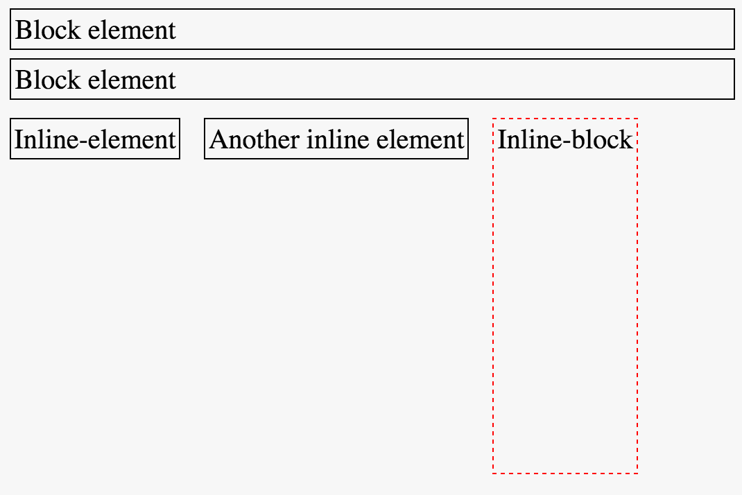
block and inline block elements
As you can see, the block level elements take up an entire row, regardless of the size of their contents. The inline and inline-block elements only take up as much horizontal space as is necessary. Unlike the inline element, the height of the inline-block is able to be set using CSS.
6.5.2 Position
In addition to how you wish elements to be displayed, you can also manipulate their position. The position property allows you to adjust the layout beyond the natural flow of elements on the page. Depending on the position property, you can shift the location of elements using the top, bottom, left, and right properties. There are four different values that the position property can take on:
Static: By default, elements are positioned statically. This is their natural layout, and elements will not be shifted by the
top,bottom,left, orrightproperties.
Relative: Allows you to shift the element relative to it’s natural position on the page. This enables you to move the element using the
top,bottom,left, andrightproperties.
Fixed: The fixed position allows you place an element in a consistent location within a browser window. For example, if you wanted a link to always be 50px from the bottom, you could set the properties:
position:fixed;andbottom:50px;.
Absolute: The absolute position allows you to place an element a specific number of pixels from it’s parent element.
To practice manipulating the position of elements, head over to exercise-2.
6.6 The Box-Model
The amount of space taken up by each element is best explained by the box-model. Think of each HTML element as some content in a box. The amount of space occupied by that box depends on:
- The amount of space between the content and the outsize of the box (
padding) - The thickness of the box (
border) - The desired distance between the box and other boxes (
margin)
Manipulating these properties allows you to specify how your content should be arranged on the page:
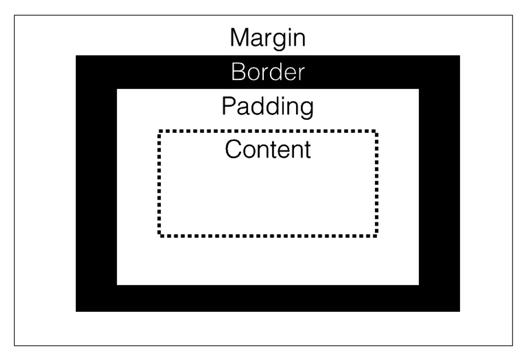
box-model
6.7 CSS Units
There are a variety of units available to you for declaring the size of elements, and the amount of space between them. Units can be specified either in absolute or relative values, each of which has some advantages.
6.7.1 Absolute Units
If you want to declare the size of an element regardless of it’s placement on the page, you’ll use absolute units. There are multiple absolute units you can use, though the most common is to use pixels(px) (table adapted from w3schools):
| Unit | Description |
|---|---|
| px | Pixel: 1/96 of an inch |
| cm | 1 Centimeter |
| mm | Millimeter |
| in | Inch |
Using absolute units in CSS is fairly straightforward – simply specify the amount of space you want for a particular property:
p {
  font-size: 20px;
  margin-bottom:10px;
  padding-top:5px;
}
6.7.2 Relative Units
Using relative units can be a bit more complex, but allows you to make more dynamic and flexible pages (more on this in the next module). We’ll focus on 3 types of relative units in this section:
- Relative to the current element’s font-size (
em) - Relative to the root element’s font-size (
rem) - Relative to the parent element’s font-size or dimensions (
%). Useful for taking up a proportional amount of space, butemis preferable forfont-size.
To begin, you should know that your browser has a default size for the root element, which is typically 16px. While it’s possible to alter this, it isn’t suggested. These could be applied as follows (inline-style used for readability):
<!-- Root font-size is 16px -->
<body>
  <!-- Section font-size will be 32px -->
  <section style="font-size:2rem;">
    <!-- Inherets font-size from section: 32px; -->
    <p>32px</p>

    <!-- Font-size will be 1/2 of parent's font-size: 16px -->
    <p style="font-size:.5em;">16px</p>

    <!-- Font-size will be 1/2 of root's font-size: 8px -->
    <p style="font-size:.5rem">8px</p>
  </section>
</body>
Note, relative sizing is not just for font-size: it is also quite useful for setting the margin or padding of an element:
/* Set styles of paragraphs using relative sizings */
p {
  margin:.5rem;
  padding:.25rem;
}
This will help keep consistent spacing across devices and screen sizes.