Chapter 7: Responsive CSS
Given the prominence of mobile devices and tablets for internet usage, it’s crucial that the websites that we build are engineered to look beautiful and work well on small devices. This module covers the skills necessary to begin implementing a mobile-first approach to web development. This approach assumes an initial build towards a mobile device, which is progressively enhanced on larger screens.
Helpful links:
7.1 Media Queries
In order to build websites that work well across devices, you need to be able to conditionally change the style given the size of the screen (or browser window). Depending on the type and volume of content of your webpage, you may want to change the size, color, layout, or any other visual properties. To accomplish this, we use media queries to determine the size of the screen, and apply specific styles. In your CSS, you can use the @media syntax to assign styles under certain conditions:
@media screen and (min-width:992px) {
  /* Assign multiple styles in here for screens larger than 991px */
  #element-1 {
    font-size:10px;
  }

  .klass-1 {
    font-size:20px;
  }
}
The above media query reads: on a device with a screen whose width is greater than or equal to 992px, assign the following styles. Because our primary styles will target a small device, we will most often use the min-width rule to conditionally assign styles to larger devices.
As you can see, you can make multiple selections to assign styles to different elements given a set of media rules. You can also write a variety of media rules to target varying device sizes:
/* These rules are applied by default */

@media screen and (min-width:768px) {
  /* These rules are applied for devices greater than or equal to 768 */
}

@media screen and (min-width:992px) {
  /* These rules are applied for devices greater than or equal to 992 */
}
Obviously, if a device width is greater than 992px, it is also greater than 768px. Luckily, your browser is intelligent enough to apply the styles to the more specific CSS selector (992px), which is what you want to happen.
To practice writing media queries, see exercise-1.
7.2 Flexbox
The Flexbox layout mode, introduced in CSS3, provides a simple syntax for distributing items within a container. While it is certainly possible to achieve the same layouts without using a flexbox display, the layout provides a variety of advantages, such as matching the vertical heights of child items. In this section, we’ll cover some of the basics of using Flexbox layouts.
7.2.1 Box-sizing
Before we can dive into using flexbox, it’s important to understand how your web-browser sizes elements (this is particularly important for aligning items). As you know, each HTML element’s size can be understood using the box model, in which every elements has some amount of content, padding between the content and its border, and margin to put space between elements. However, when you’re assigning a size such as width, HTML does not (by default) include the padding or border in the size of the elements.
To adjust this, we simply want to set the box-sizing property to border-box. This includes the padding and border in the size of each element, making it easier to more accurately descrie the desired size of your items. It’s common to apply this style to all elements on your webpage, which you can easily do using the * selector:
* {
  box-sizing:border-box
}
You’ll likely include this in all of your CSS files moving forward, and it should not (negatively) interfere with your other stylings.
7.2.2 Structure
To implement a flexbox layout, you’ll create a flexbox container, and place multiple items inside that container. For example:
<!-- HTML file with flexbox elements -->
<div class="flex-container">
    <div class="flex-item">
        <h2>Column 1</h2>
        <p>...</p>
    </div>
    <div class="flex-item">
        <h2>Column 2</h2>
        <p>...</p>
    </div>
    <div class="flex-item">
        <h2>Column 3</h2>
        <p>...</p>
    </div>
</div>
/* Apply flexbox styles in your .css file */
.flex-container {
display:flex; /* Set the display to flex! */
}
.flex-item {
flex-basis:25%; /* Set the amount of horizontal space to take up */
}The purpose of the flexbox layout (display:flex;) is to manipulate the layout of child elements within the container. The flexbox style does not affect anything outside of the container, or inside of the child items. Instead, it simply arranges the items inside of the container by manipulating their width, height, and alignment.
In the above example, each item with class .flex-item is set to take up 25% of the width of the flex-container. While we could have used width instead of flex-basis in the example above, flex-basis is far more extensible.
Here are a few additional properties you may want to apply to your flexbox container to configure the layout of your items:
justify-content: Horizontally distribute items in your flexbox container, at the start (flex-start), end (flex-end), or center (flex-center) of the container. You can also add space around (space-around) or between (space-between) items.align-items: Vertically distribute items in your flexbox container, to fill the container (stretch), at the start or end of the container (flex-start,flex-end), in the vertical center (center), or at the bottom of the container (bottom)flex-wrap: Wrap items onto a new line if necessary (wrap,nowrap, orwrap-reverse)
Based on these (and a few other) properties, your browser will compute the optimal layout for the items within your flexbox.
7.2.3 Flexbox and Media Queries
While it is possible to leverage flexbox to change the number of items in a given row, you will still need to use media queries to gain full control over your layout across devices. The most common change you’ll want to make is adjusting the amount of width taken up by each flex item by adjusting the flex-basis property. This is easily implemented using media queries:
/* Have each item take up 100% of the flexbox-container */
.flex-item {
  flex-basis:100%;
}

/* On larger screens, have each item take up 25% of the width */
@media screen and (min-width:768px) {
  .flex-item {
    flex-basis:25%;
  }
}
Note the mobile-first approach used in the code section above: the default properties describe rendering on a small device, while the large device properties (flex-basis:25%) are assigned using a media query.
To experiment with flexbox, checkout flexboxfroggy, or see exercise-2.
7.3 CSS Frameworks
A CSS framework is a pre-written set of CSS files that apply styles to your elements. Even for basic tasks, it makes sense to use a CSS framework to structure your code. They are particularly useful for making sites responsive based on screen size, which we’ll describe below. There are dozens of available frameworks, but the important thing is that you choose one that you like, and can build on the work of others.
Two of the most popular frameworks are Bootstrap, developed by Twitter, and Materialize, whose design was inspired by the material design principles championed by Google. Both of these frameworks provide well great default styles for common HTML elements (buttons, dropdown menus, headers, footers, etc.) and, more importantly, leverage similar concepts for achieving a responsive layout (laying out elements in responsive grids). In this module, we’ll describe the use of Materialize, but the approach to using Bootstap (and many other frameworks) is nearly identical.
To use a CSS framework, you simply read the file(s) into the head section of your .html file. Note, some frameworks leverage JavaScript files for more advanced interactivity – these are only required for certain elements (such as modals, which are like fancy dialog boxes) to render properly:
<head>
  <!-- Compiled and minified CSS -->
  <link rel="stylesheet" href="https://cdnjs.cloudflare.com/ajax/libs/materialize/0.97.5/css/materialize.min.css">

  <!-- Load jQuery library, a dependency for Materialize -->
  <script type="text/javascript" src="https://cdnjs.cloudflare.com/ajax/libs/jquery/3.1.1/jquery.min.js"></script>

  <!-- Compiled and minified JavaScript -->
  <script src="https://cdnjs.cloudflare.com/ajax/libs/materialize/0.97.5/js/materialize.min.js"></script>
</head>
Once you have loaded a framework, you will want to assign the appropriate classes to your HTML elements to apply the pre-written styles. For example, assiging a <button> element class btn will apply your styles (assuming you have loaded the framework, of course):
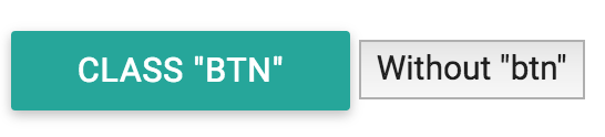
buttons with and without class btn
The classes you need to use are well described in the documentation. While a framework can help with the styling of individual elements, it’s real power is in helping layout elements for different screen sizes.
7.3.1 The Grid
While you can write media queries yourself, it can be easier (and more consistent) to leverage the pre-defined styles that are written in the CSS files of your framework. Both bootstrap and materialize allow you to create a grid system to arrange elements on the screen. The premise is that a row takes up the width of your screen, and is always 12 columns wide. Then, you can apply a pre-defined set of CSS classes to describe how many columns you want an element to occupy given a certain screen size. Here is the table of screen sizes for each class for the Materialize framework:
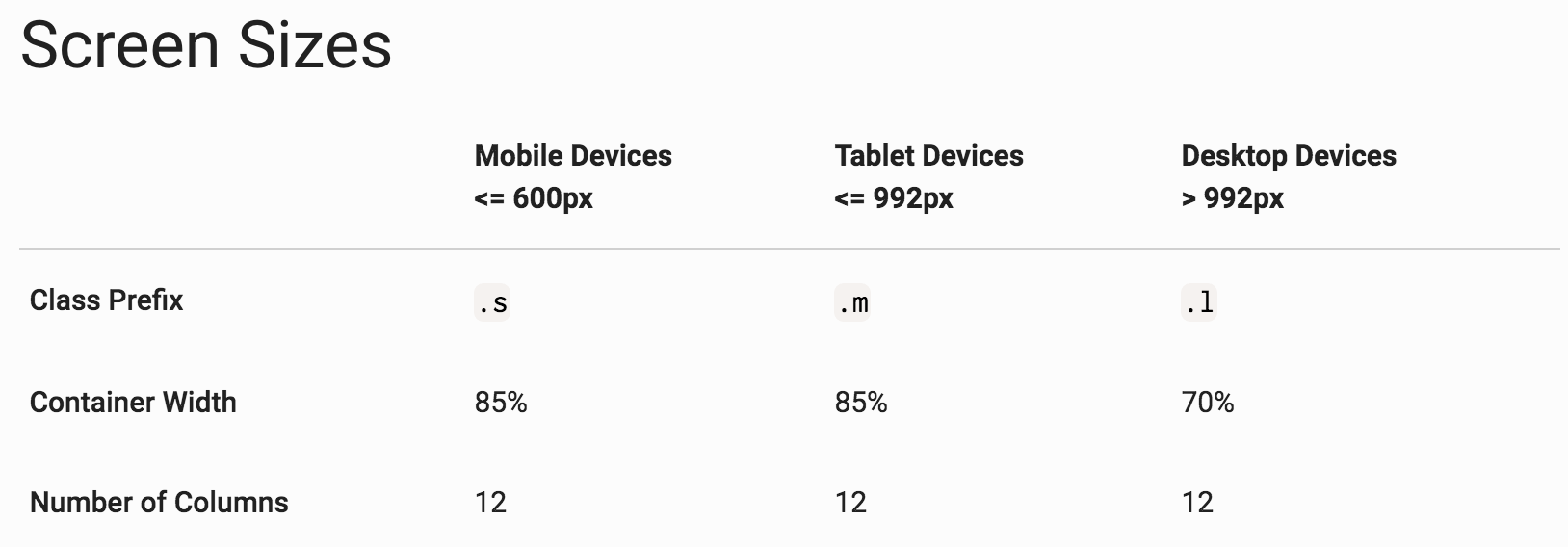
table of sizes for materialize classes
For example, you could apply a class size of col s12 to have an element take up 12 columns on a small screen. You can also describe multiple classes to declare different layouts for different screen sizes:
<!-- Container div with pre-set styles from Materialize -->
<div class="container">
  <!-- A row for your grid -->
  <div class="row">
    <!-- An element that will take up:
      - 12 columns on a small screen (<=600px),
      - 6 columns on a medium screen (<=992px), and
      - 4 columns on a large screen (>992px)
    -->
    <div class="col s12 m6 l4">...</div>
  </div>
</div>
Under the hood, materialize is (of course) using media queries to describe different behaviors at different screen sizes (there’s no magic here).
For practice using the grid system and Materialize framework, see exercise-3.